Getting to know PERMASET textile screen printing inks: Working with colour (Part 2)
Part 2 – How to Create Great Colour Schemes for your Screen Print
In Part 1, we looked at getting the most out of PERMASET Screen Printing Inks by working with reductions to produce a range of tints from each colour in the PERMASET AQUA range. In Part 2, we’ll look at some tried and tested colour schemes for screen prints to get that perfect colour combo for your next project. So read on and get inspired!
Standout colour combinations are an effective way for your design to get the attention that it deserves. Printing colour on textiles, paper and other substrates can be tricky if you’re creating your designs digitally, so it’s always a good idea to screen print colour samples when assessing a colour scheme.
The Basics of Colour – The Colour Wheel
Most people are familiar with the colour wheel that we learned in school and that is made up of primary red, blue and yellow. These primary colours, when mixed, produce the secondary colours of purple, green and orange.
Understanding the colour wheel and how it can be used to create colour harmonies is central to creating standout colour combinations.
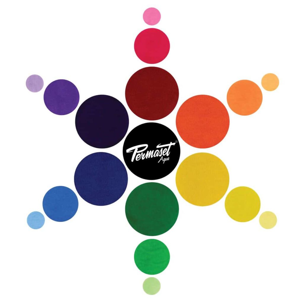
The colour wheel can be further expanded by including 13 of the 19 PERMASET Standard Colours. (The PERMASET Standard Colours not shown on the colour wheel are White, Jet Black, Venetian Red, Brown R, Dark Brown and Light Blue.)
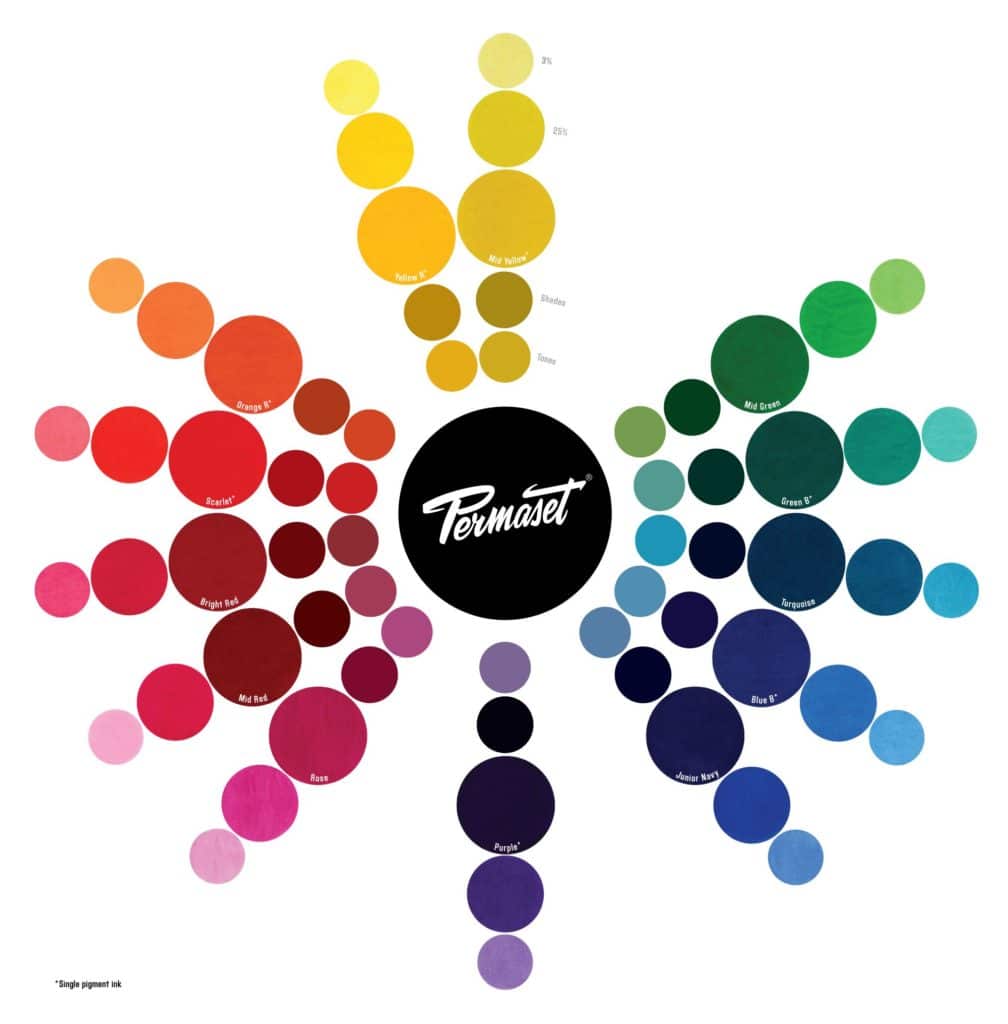
Also shown on the PERMASET colour wheel are tints (or reductions) at 25% and 6%, tones and shades. Tints (or reductions) are shown on the outer two rings and tones and shades are shown on the inner two rings. Tones are created by mixing grey (white and a little black ink) and shades are created by adding a little bit of black to the colour. Read Part 1 to know more about reductions. We will use unreduced (pure) PERMASET inks and their tints (reductions) in our colour combinations later on.
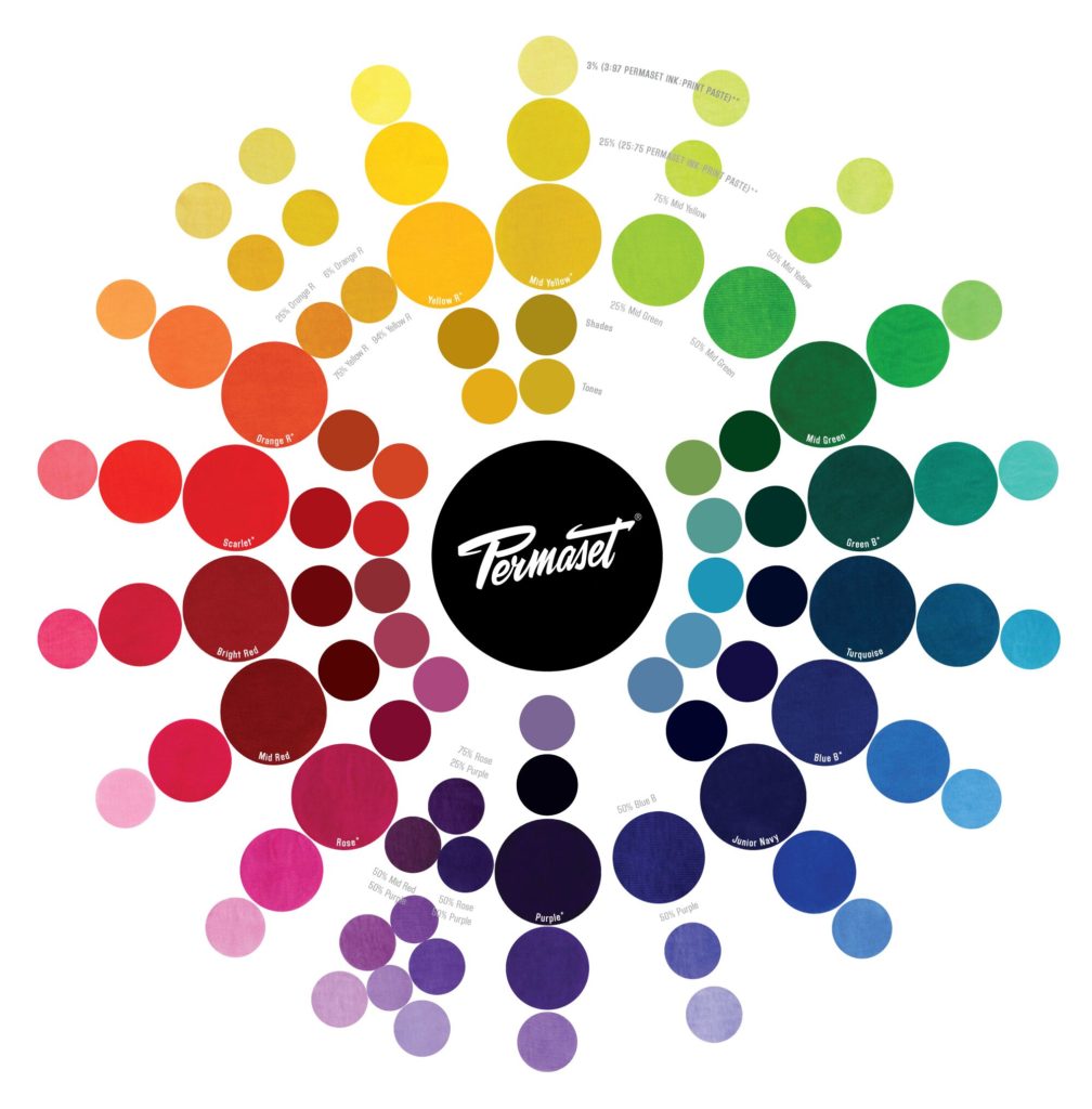
As you can see on the colour wheel above, there are some gaps and these should be filled in so we have a more complete range of colour choices when creating our colour combinations.
We prepared PERMASET Ink mixes of:
- 94% Yellow R and 6% Orange R
- 75% Yellow R and 25% Orange R
- 75% Mid Yellow and 25% Mid Green
- 50% Mid Yellow and 50% Mid Green
- 50% Blue B and 50% Purple
- 50% Rose and 50% Purple
- 75% Rose and 25% Purple
- 50% Mid Red and 50% Purple
These were printed and added to the colour wheel. The exact ratios of PERMASET Ink mixes don’t really matter that much – they are rough estimates to create colours to fill the gaps in the colour wheel. You can create your own blends to fill the gaps.
So now our colour wheel is ready to use to create vibrant colour combinations.
The Four Basic Colour Harmonies
The simplest colour harmony, the Monochromatic palette, is based on the tints, tones and shades of the same colour or hue.
Monochromatic colour palettes are gentle and soothing. Create interest by varying the brightness (or value) of adjacent colours in your design. This creates colour combinations with good contrast.
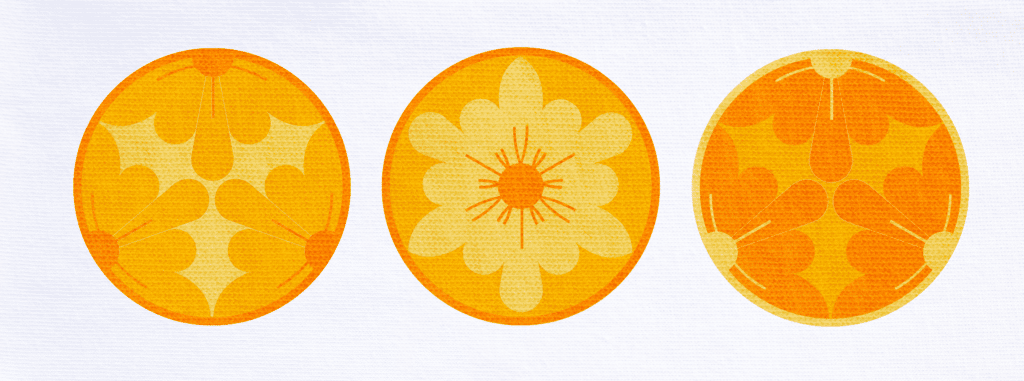
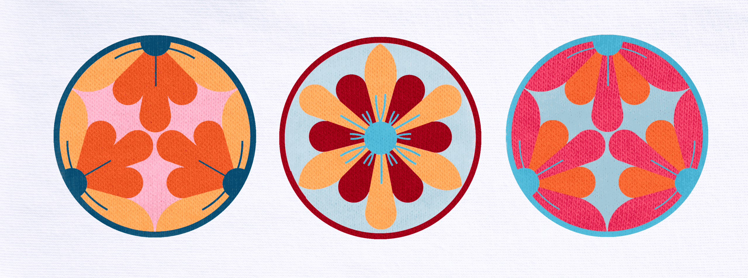
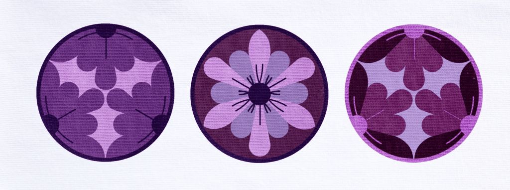
Analogous colour palettes are based on three or more colours that are next to each other on the colour wheel.
Analogous colour combinations give a sense of harmony and balance.
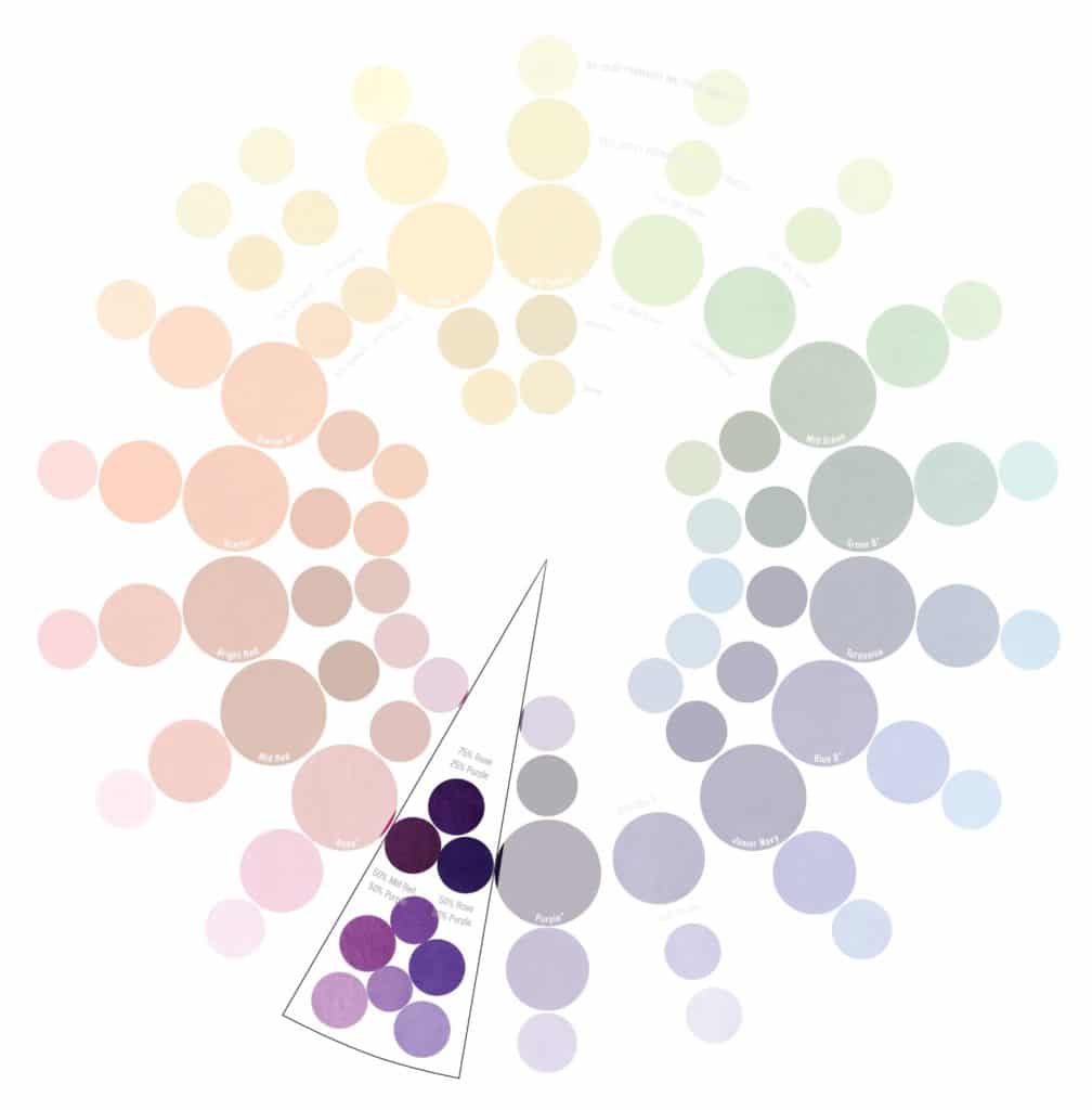
The design shown below is made up of colours blended from 50% Rose and 50% Purple, 75% Rose and 25% Purple, 50% Mid Red and 50% Purple at 100%, 25% and 6% reductions. Remember to create interest by varying the brightness (or value) of the adjacent colours in your design.
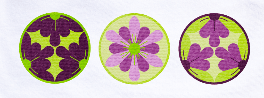
To achieve colour combinations of high contrast, complementary colour harmonies are created. These are colour schemes based on colours chosen from opposite sides of the colour wheel.

Colour schemes based on complementary colours have high energy and are visually interesting. Complementary colours schemes are a good choice when you want to make a statement with your design.
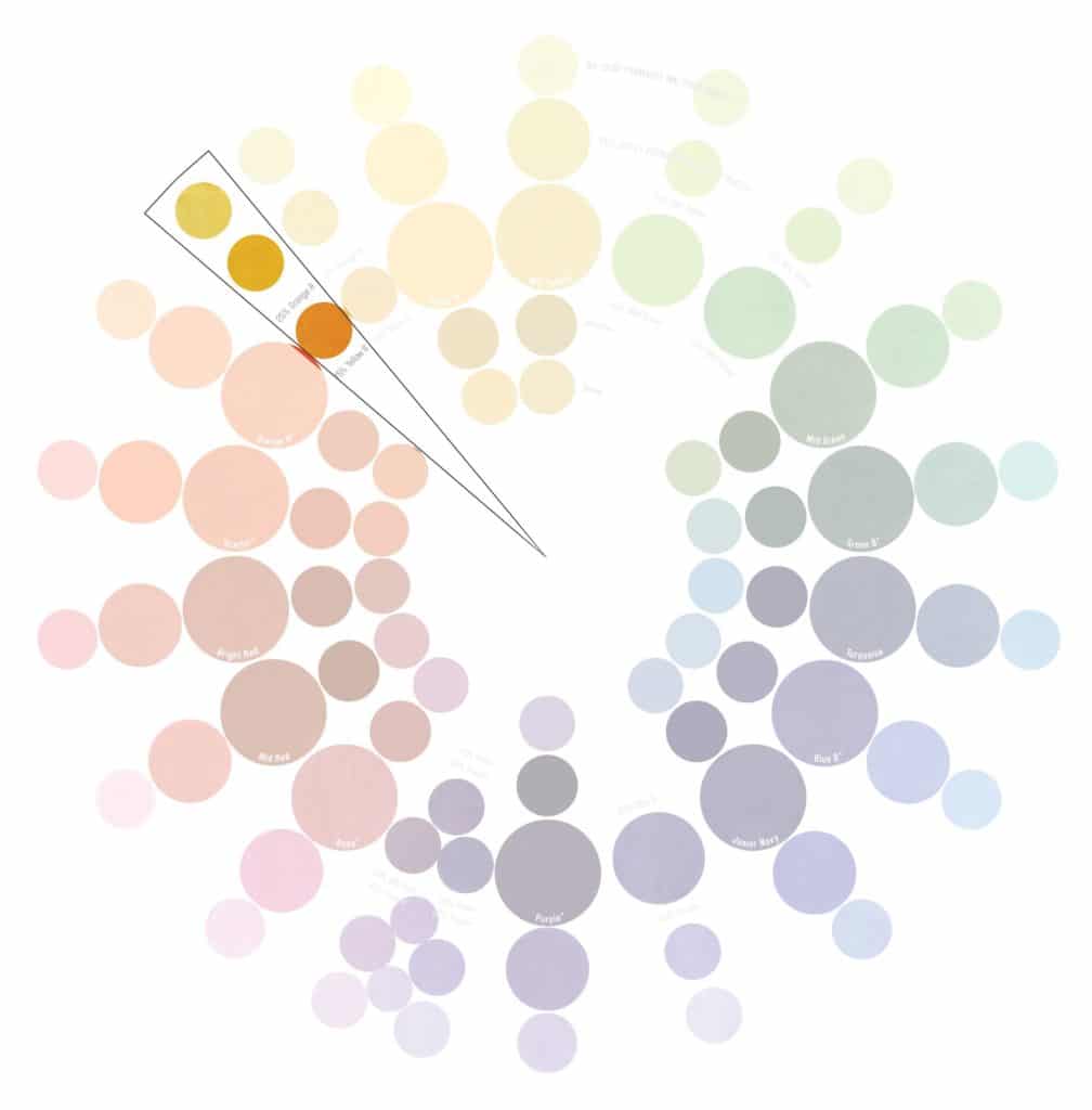
The fourth basic colour combination, a split complementary harmony results when one colour is paired with two colours on either side of the original colour’s direct opposite on the colour wheel (see the diagram below).
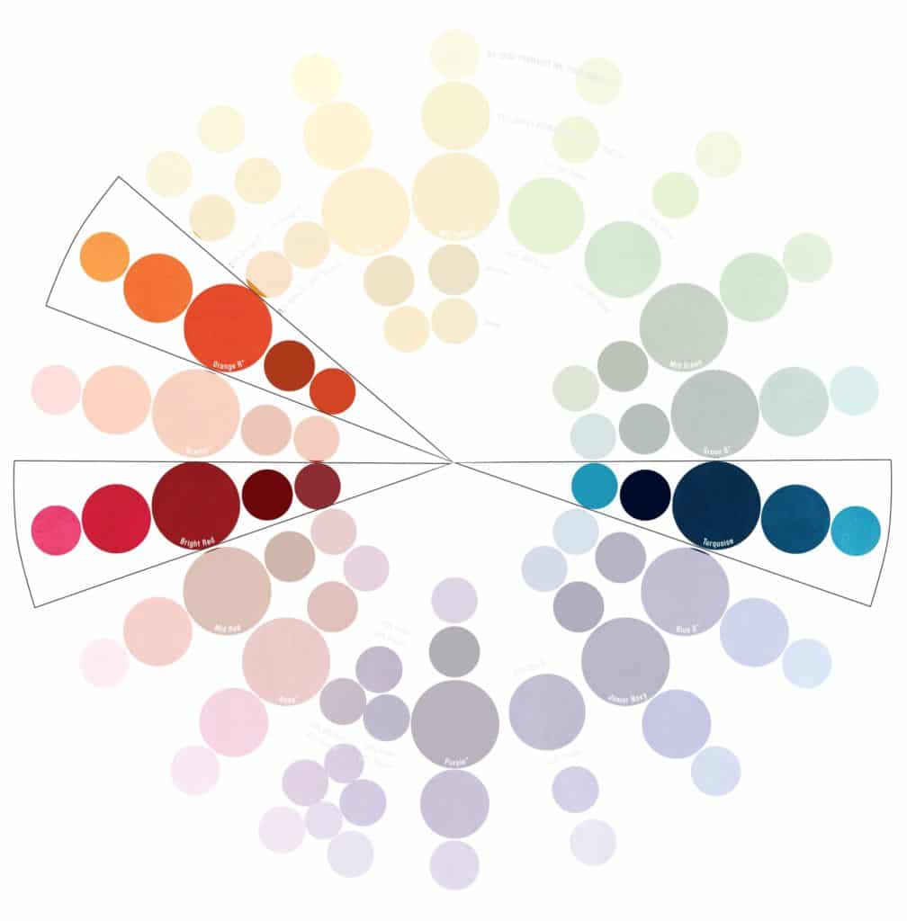
Colour schemes based on split complementary colour arrangements are high contrast and visually exciting. These colour schemes are a little more sophisticated than complementary colour combinations. The key to making complementary and split complementary colour combinations work is to vary the brightness (value) of the colours (by using reductions) for high pop value.

Breaking the Rules
If you find yourself always gravitating to the same colour or you just can’t seem to get that great combination to work, then these four colour harmony tips can help by offering tried and tested suggestions for you to use. There are other colour harmonies to discover too, so as you become more confident, go ahead and break the rules. The great thing about colour is to mix, print and see how you feel about it and have fun along the way.
It’s also helpful to keep a work book or colour diary. Record the mixes that you make and include a sample print stapled into the book. While it may slow you down at first, this book will become an invaluable resource as you keep adding to it. As you become more comfortable with this, you might also include info such as mesh size, squeegee type and number of pulls.
COLORMAKER INDUSTRIES© 2022.
Subscribe to get the latest inspiration, news & advice direct to your inbox
More articles
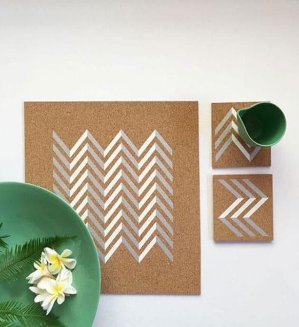
 @imearthie
Clothing label I’m Earthie shares how they strive to be a truly sustainable brand
Clothing label I’m Earthie shares how they strive to be a truly sustainable brand